Monday, May 28, 2012

Our kitchen...Not quite done!

*Please note, that our kitchen is still FAR from done! 

So, yes, it has been a while people. This delayed post is a result of two things: one, my camera being stolen (ugh) and the fact that we had to take a little break from housing renovations (money.) Well, we haven't done much...up until a month ago when we put a down payment to have our kitchen cabinets made! We were so glad that we didn't do the kitchen right away! It gave us time to live in this house and really think about the layout. We changed it a number of times until finally settling. 

Since it has been while, let me refresh your memory of what the kitchen looked like when we first bought this shack:


We thought about keeping the layout the same....considered removing the island....thought about adding an island somewhere else....but...in the end we decided that we wanted a BIG kitchen, and that meant thinking outside the "kitchen-box."

So to the web we went, and here is what we found:


Notice a reoccurring theme?  All these kitchens are eat-in...dining table and all. With this plan, we'd pretty much double the size of our current kitchen and as I previously stated, this was extremely important to us. So after much thought, and many, many, many web and magazine inspirations, we decided to expand the boundaries of our kitchen in to the dining room to create one big eat-in space.

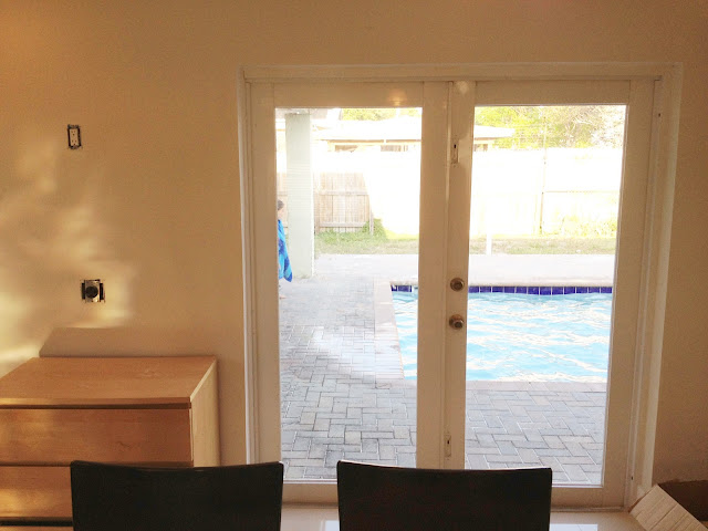
The first step was replacing this with a window:


I was really sad to see it go, but we NEVER use these doors to get to the pool. We have another single french door off the kitchen that we use. Even with my hesitation, seeing the finished product, I know we made the right decision!

And here is what we've got so far:


The shot above is from the edge of the living room. As you can see, the door is gone and it has been replaced with a window. The light fixture is yet to be centered and you may be wondering what the hole around the fridge is. Well, we plan on getting a 48-inch built-in (SubZero or KitchenAid) refrigerator. It is quite a splurge, and its not something we plan on buying right away, but its at the top of our list!


Another item at the top of our list is a new, stainless steal slide-in range along with a hood. You can see that we already have the wiring set up for our future hood.


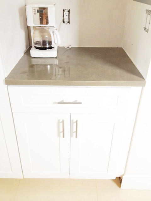
Above, you can see what I affectionately call the alley-way. You can see the door that we use to get to the pool area. Back by that door is the microwave and the pantry, as well as a little nook we have to hide things we don't want people seeing, like coffee pots, juicers, and cat food!


Speaking of pantry, all our cabinets come with slide-out shelves which makes reaching, and organizing, much easier:


I even asked the cabinet guy to create a slide-out shelf under the sink! I'm hoping this will help me keep things tidy down there:

 
More slide out shelves for dishes:

In addition, we installed a new faucet:


While planning the kitchen, we realized how much recyclables we collect on the counters. So with that in mind, we made room for two garbage cabinets:


The hole to the right of the garbage will house a small wine fridge.

Well there you have it. Almost done. We are still waiting on two floating shelves to be built, which will go on the wall above the garbage/wine fridge and we need to pick out back splash. We also plan on building a new dining room table, modeled on this one:


Micah does business with a welder, and we can totally bang out the wood planks in a day.  But again, that is a project for another day. 

Just so you don't have to scroll all the way to the top, here it is again. We are super happy with it and can't wait to hear what you guys think!


Friday, February 10, 2012

Art

Things are moving at a snail pace over at the shack. We finally put something on the wall! Not the most exciting post, but I figured I would share.


I got this Marimekko fabric FOREVER ago! I stretched it out using a kit I purchased online and turned it in to instant art....for cheap! Slowly but surely, things will come together! Happy Weekend!

P.S.-Check out those floors! So shiny!!!! 

Thursday, February 9, 2012

Color Combo: Navy & Coral

My BFF is visiting from South Korea and its been great spending time with her! I've been busy picking her brain for suggestions on what to do with the house and it just so happens, one of her gifts has been a great source of inspiration. She brought me this shirt, which I am so obsessed with!


It's so hard to show in the picture, but it is the perfect combination of navy, coral and light taupe. Here's a close-up shot:


Again, pictures never capture the true color! So frustrating. I'd love to try to incorporate this color scheme somewhere in the house. Currently, the only room that is a blank slate is the office. I'm not sure if the Mr. would be down with it, but I thought I'd give it a try! So a little searching on the web and I found these two colors:


Here's the deal, the office is small, and it doesn't get the best light, so I'm conflicted over whether or not to paint the wall the dark navy or the coral. The taupe on the dress is almost an identical match to the color already on the wall, so I could just keep the existing color and use the above colors as accents. 

So here are some inspiration pictures:
Lonny Magazine
I love that the walls in this room are light and that there are pops of color throughout. How bad-ass is that painting?

Lonny Magazine

Dark walls. Hmmmmmmmmmm. I do appreciate the color contrast. The tree wallpaper is pretty awesome! It's from Urban Outfitters. 


Diane Bergeron

This picture proves that dark walls does not shrink a room. The white and navy contrast is great! 
Sweet Southern Sunshine
I pretty much love everything about this room. The headboard is unbelievable, the quatrefoil pillows rock, and the coral stools at the beds' end are a sweet touch. 


Massucco Warner Interiors

I love the design on the back wall, not to mention everything else. I wish I could incorporate a little office nook in the closet! It would save us so much space. 


Girl and Great Dan

Coral walls! And the rug could totally play in to a modern nautical room if styled correctly.  
Infarrantly Interiors
Love, love, love the headboard! Not exactly navy, but I had to post this pic! 

It's really not like me to be this bold (quite frankly, it might not even be very bold to some of you) but I am just really drawn to this color scheme. I think because it reminds me of being on my boat and snorkeling in the ocean.

Using these pictures, I found some great items online that would go perfect with this theme!
One Kings Lane

Urban Outfitters

Etsy


Etsy

Etsy
  
Dash and Albert Catamaran Rug
Ballard Design
Ballard Design
CB2       
West Elm
Dorothy Draper Dresser
What are your thoughts on this color combo? Too bold? As far as walls, what would you do? Navy, coral or light taupe?

Saturday, February 4, 2012

Done! Well, Almost

After working hard to knock these out, I needed to listen to something soothing; in comes Of Monsters and Men (again.) The song is "Love love love"


The closets are 99% done! Aside from baseboard, which we had to order, everything is hung, and in its place. Bye-bye ugly clothes pile! Here's the finished product:


The above shots are before we installed the drawer hardware. In case you are wondering who gets what side, left side is mine. I needed more space to fold my clothes so we built me an extra shelf.

Here's a close-up of the shelves:


And a shot of the drawers, with the hardware:


Now all we have to do is decide on the next project! Happy weekend everyone!

Friday, February 3, 2012

We Did It: Closet Drawers

I doubted our skills, but man, was I wrong. We knocked out some amazing drawers for our closet. We were originally going to order some online, but they were going to cost us $300! So we measured, cut, and routed lots and lots of good quality, sanded, 3/4" premium pine.


The routing was to accommodate the bottoms of the drawers, which were made of 1/4" sanded plywood.


We also made good use of our Kreg Jig. We used the pilot holes to secure each piece of wood together.


From there, it was as simple as a few screws, and a  bit of shimmying.


And finally, we had a box!


Up next, was installing high-quality drawer pulls, which were purchased off Amazon, onto both the box and the cabinet itself.


Here is where things got tricky, because the measurements had to be precise. We still hadn't placed the drawer fronts, which were going to be larger than the boxes. Each measurement had to take the drawer front into consideration, as well as the small space between each drawer that would allow them to open and close with ease. We figured out that it was easiest to measure from the top of the drawer slides that were attached to the cabinet.


Finally, we had something that looked like this:


The drawer fronts were made of MDF, painted white, and we routed some lines to give it some depth


We don't have the hardware installed yet, and still need to touch up paint, not to mention wrap baseboard around the bottom to make it look built-in, but it is still looking pretty sexy.


We should be done tomorrow! I can't wait to start hanging up my clothes and get things in order around here...